Latest News
-
 India's Elections Trigger Airfare Surge in Tamil Nadu
 -
 Citroën Reveals All-New C3 Aircross For Europe
 -
 Suzuki Motorcycle India Achieves Production of Over 8 Million Two-Wheelers
 -
 Maruti Suzuki Swift Sees Price Hike Across Variants: New Model Launch In May 2024
 -
 Bentley Arnage R Abandoned In Pune: Sparks Discussion On Luxury & Neglect
 -
 Aprilia RS 457 Accessories: A Detailed Look At The Prices
 -
 All About Electronic Stability Control (ESC): Working & Advantages
 -
 The Rezvani Retro RR1 Is A Modified Porsche 911 Done Right
 -
 Google Maps To Ease EV Charger Finding With Latest Updates
 -
 India's UDAN Scheme Offers Air Travel Fares As Low As Rs 150
Car Logos History 2: Ten Iconic Car Emblems With Great Tales To Tell
Logos are often the first point of identification for a brand, so getting it right is always of utmost importance, in the world of automobiles too. We've already told you the tales behind the symbols of some of the world's most famous car manufacturers in the first of this series, but will get in-depth with the stories of ten more in this special follow-up story.
In our second visit to the history books of these vital brand identities, we bring you the lowdown on the stories of ten carmakers, including Chevrolet, Renault, Citroen, Ford, and much more.

1. Chevrolet
One of the most famous car logos in the world is actually shrouded by a fair bit of mystery, with three versions of the origin of the Bowtie stemming from the family of the founder, William C. Durant. His own version states that the design was inspired by the wallpaper in a French hotel, which was put forth in a Chevrolet 50th anniversary publication as well.
His wife, Catherine, however said that the idea came from a newspaper he was reading before the reveal of the logo to the world, which historian Ken Kaufman suggested came from a 1911 "Coalettes" print advertisement. But Margery, Durant' daughter, had her own say too, publishing in a book that he often doodled nameplate designs, saying it was 'between the soup and the fried chicken one night' that he drew out the Bowtie. And to top it off, Chevy's 100 year celebration releases this time held the logo's history was uncertain...

2. Renault
Easily one of the most beautiful logos in the world has to be the stunning Renault emblem, that is instantly recognisable across the planet. The first Renault logo was born in 1900, but the diamond-shaped corporate identity came about only in 1925. A major (and successful) redesign by Victor Vasarely came in 1972, when the logo got some 'oomph' and set the tone for the modern versions.

The symbol has since progressed into the yellow square and diamond that we know today. In Renault speak, the yellow represents prosperity, energy, joy, and optimism. The silver is said to embody perfection, sophistication, and creativity.

3. Skoda
Skoda used to be a very, very different company before Volkswagen took over, and the logo's origins date all the way back to 1923. But the history of the symbol is a bit hazy, with one of Skoda's own websites saying the idea 'may' have been Plzen T. Maglic's, the commercial director of the company at the time.

The logo evolved to the version that we're most familiar with - the black outer circle and green 'Winged Arrow'. The design is also sometimes thought to be 'the stylised head of an Indian wearing a headdress with five feathers'. Black symbolises the brand's 100-year tradition while green stands for its environmental production. The design has currently evolved to 'lush green' from the earlier 'natural green.'

4. Mitsubishi
In Japanese, 'Mitsu' means 'three', and 'hishi', which becomes 'bishi', means 'water chestnut' and is used to denote a diamond shape or lozenge. The unmistakable logo was decided for the company by Yataro Iwasaki, the founder of the original Mitsubishi company.
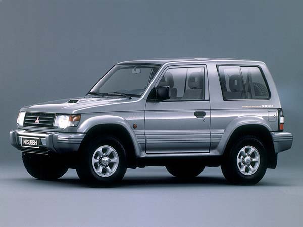
The three diamonds are an arrangement of two family crests, the first of which is the three-oak leaf of the Yamauchi family, Lords of Tosa, the birthplace of Yataro. The second was that of the water chestnut crest of the Iwasaki family.
5. Peugeot
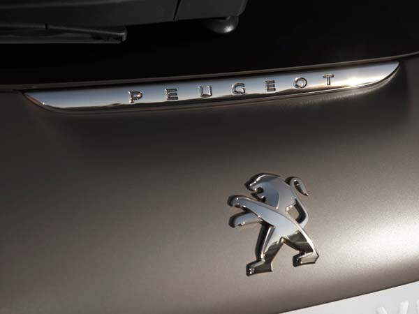
This extremely well-known emblem comes from the coat of arms of Franche-Comte, the birthplace of the Peugeot family. The Lion symbol designed by Justin Blazer began appearing way back in 1847 on Peugeout-made saw blades and steel products from the company's cereal mill-turned-steel foundry. Incidentally, the first vehicle bearing the logo was a tricycle in 1889.

The first Peugeot cars with the emblem were 'Peugeot Lion' automobiles manufactured by the 'Peugeout Bros.' company. At the time, it was the profile of a lion on an arrow. The logo then evolved into a roaring lion in the 1930s, till 1968 saw it become close to today's design. Currently, the Peugeot Lion is beautifully classy and simple, while looking completely modern at the same time.

6. Honda
One of the cooler Japanese car manufacturers is known for creating a large variety of cars and motorcycles that are capable across various segments, from small economical four- and two-wheelers to high-performance sports cars and bikes. Honda's 'H' logo is said to symbolise durability and confidence.

The thinking behind the logo was that it had to be depictive of the company's operating units. 'H' simply stands for Honda, while the winged logo is used on their motorcycles, which is said to be a symbol of speed and performance. One of the more non-fussy logos out there, the 3-dimensional 'H' seems set to soldier on as the company moves towards what looks to be a long and successful future.
7. Citroen
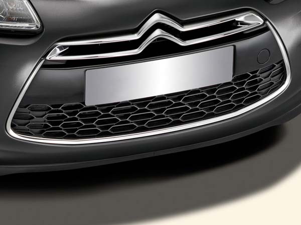
Double 'chevrons' are representative of what is an unimaginably important Citroen invention, the helical gear, that is used by every vehicle on the road today, since it eliminated former noisy gearboxes that were plagued with unreliable transfer of power as well. One of the unique things about this company's depiction of the logo is that it often varies from car to car to 'enhance and balance the harmony of the overall front-end styling'.
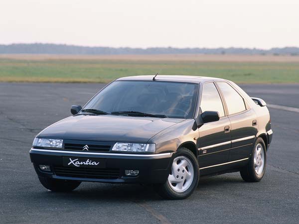
Earlier pre-WWII logo designs of the French manufacturer were larger and more dramatic, like on the Citroen Traction Avant, but began slimming down from the 1960s through the 1980s. Interestingly, technical challenges arise from these variations on the logo, since the upper bar can be attached to the bonnet, and the lower to the bumper, for example. As a result, temperatures can vary significantly in these areas and the logo parts need to designed differently to allow for varying 'dilation'.

8. Lotus
Another famous logo for a much respected British carmaker. The lettering seen on above 'Lotus' on the emblem are the initials of Anthony Colin Bruce Chapman - designer, builder, and founder of Lotus. There's also the triangle in British racing green, the colour reserved for racing cars from Britain competing in international motorsport events.

Behind the triangle is the yellow background that signifies the 'sunny days' that Colin Chapman hoped were in store for Lotus' future. There was also a stage when all Lotus cars wore a black badge - those were out of respect for World Champion driver Jim Clark's passing in a Lotus Type 48 Formula 2 race car.

9. Mini
The Mini logo has the legendary British company's name in uppercase enclosed by a circle, while the wings are a symbol of speed, agility, power, and freedom. The black is said to symbolise excellence, strength, innovation, elegance, and the dynamic attitude of the brand, while silver stands for sophistication and grandeur.

Some feel this winged-logo was a natural adoption by Mini as several cars of the time featured winged emblems and badges. The Mini logo was modified as recently as June 2015, and now uses a 'clear, emotional design with a focus on the essential.'

10. Ford
Thought we'd save possibly one of the most classical logos of all times for the end, that of America's much-loved Ford Motor Company. Ford's Blue Oval has been in use for more than 50 years, but the history of the logo actually dates all the way back to 1906, when Henry Ford's engineering assistant created a stylised version of the words 'Ford Motor Company.'
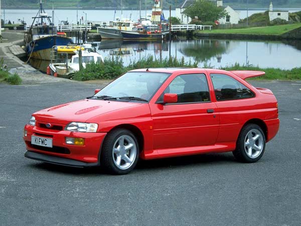
The logo then progressed into what was known as the 'script with wings', with the adoption of the long-tailed 'F' and 'D' letters. In 1927, the Ford Oval Badge with a blue background appeared on the Model A, and was seen up until the 1950s, till a gap in its usage followed till the mid-1970s. However, since 1976, the logo has hardly changed to this day, as evidenced by the Blue Oval on the hood of the spanking new Ford GT (previous image), that is slated to arrive some time in 2016.


 Click it and Unblock the Notifications


